The art of making an office feel something like a home.
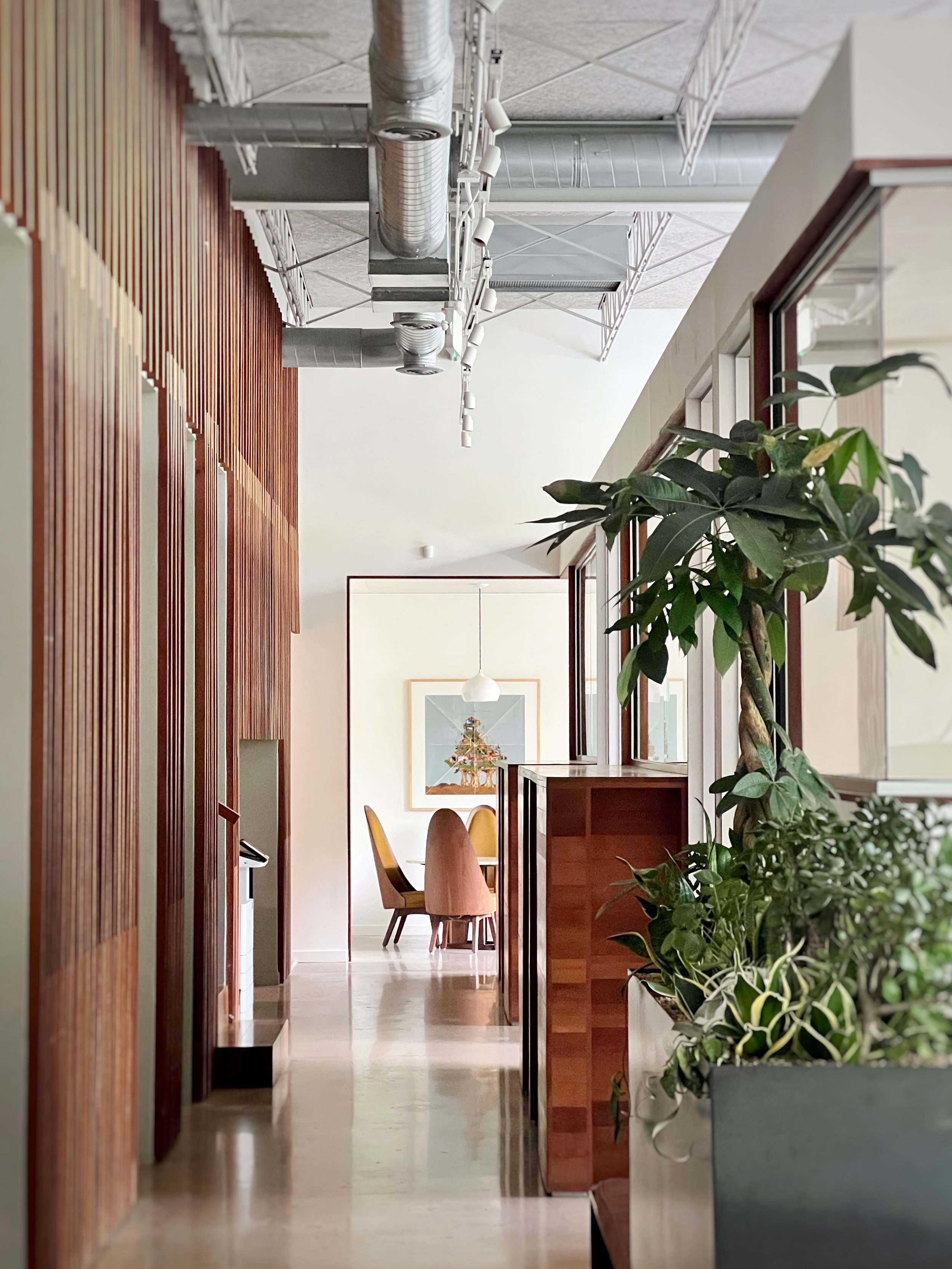
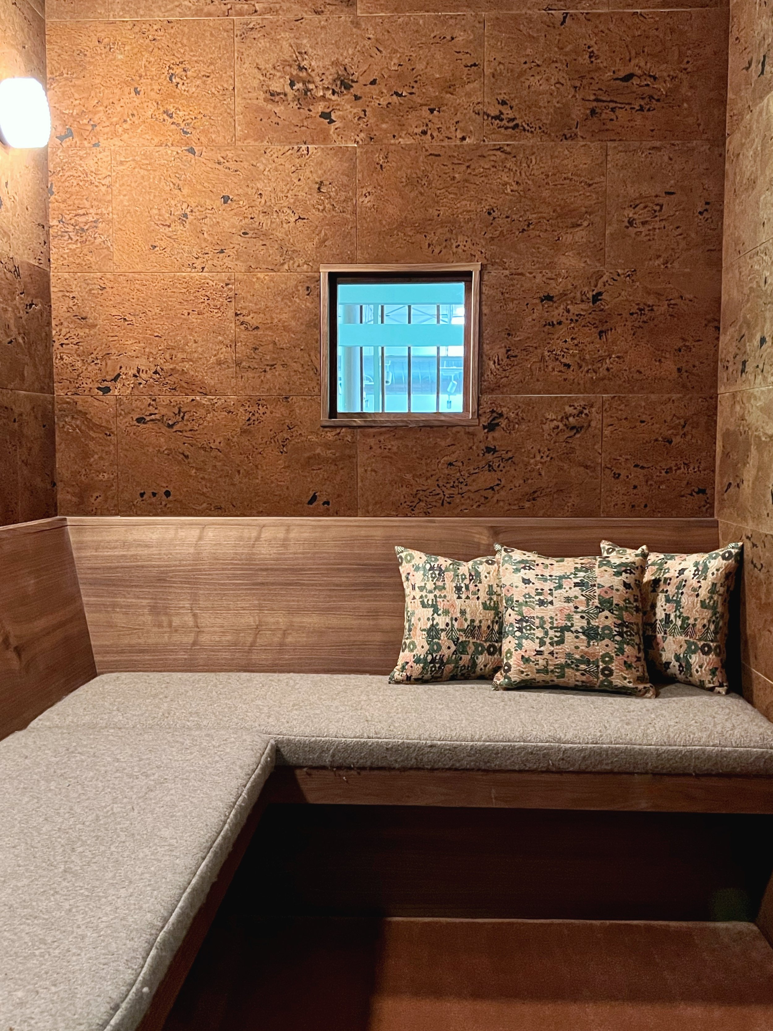


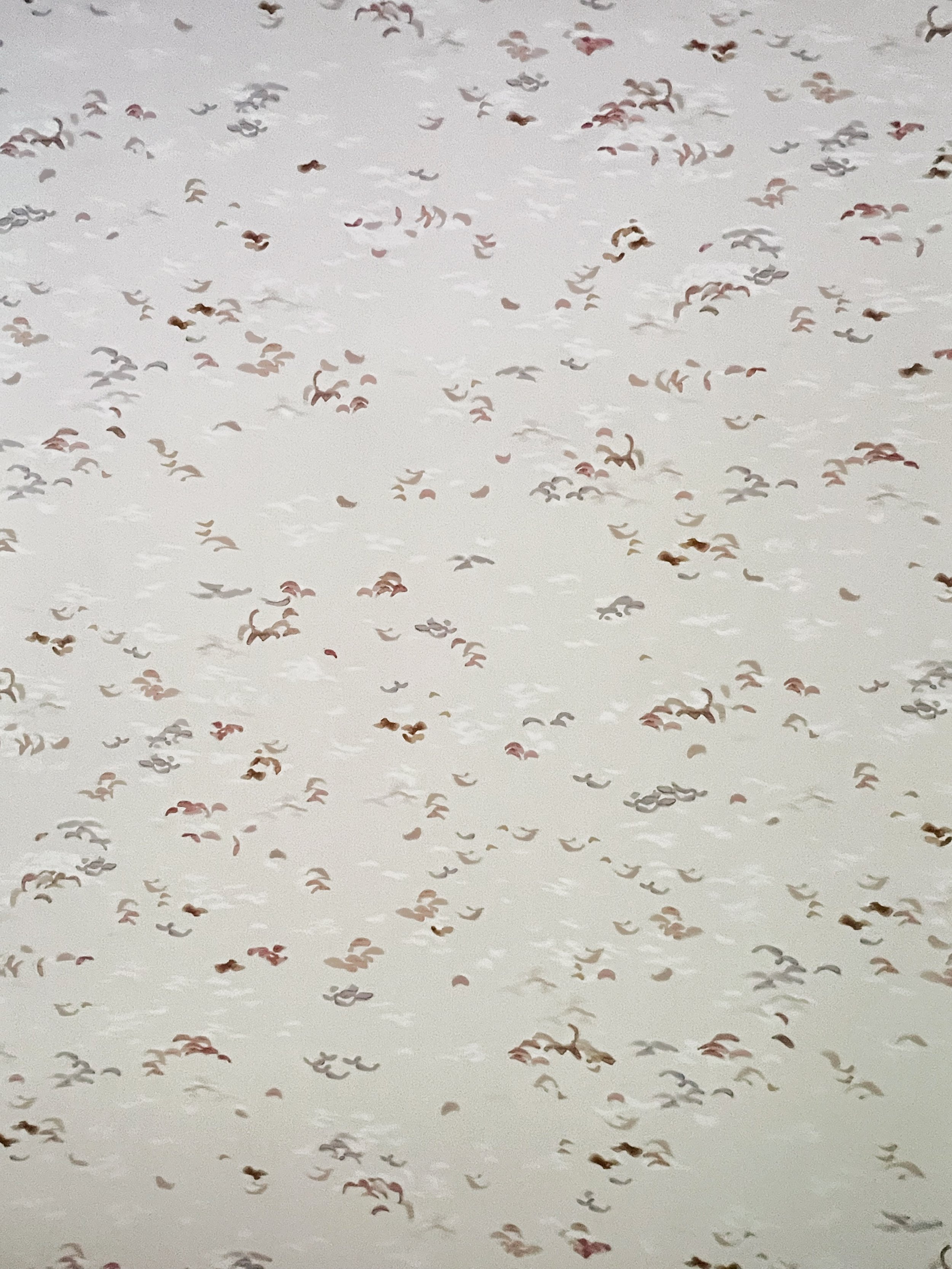
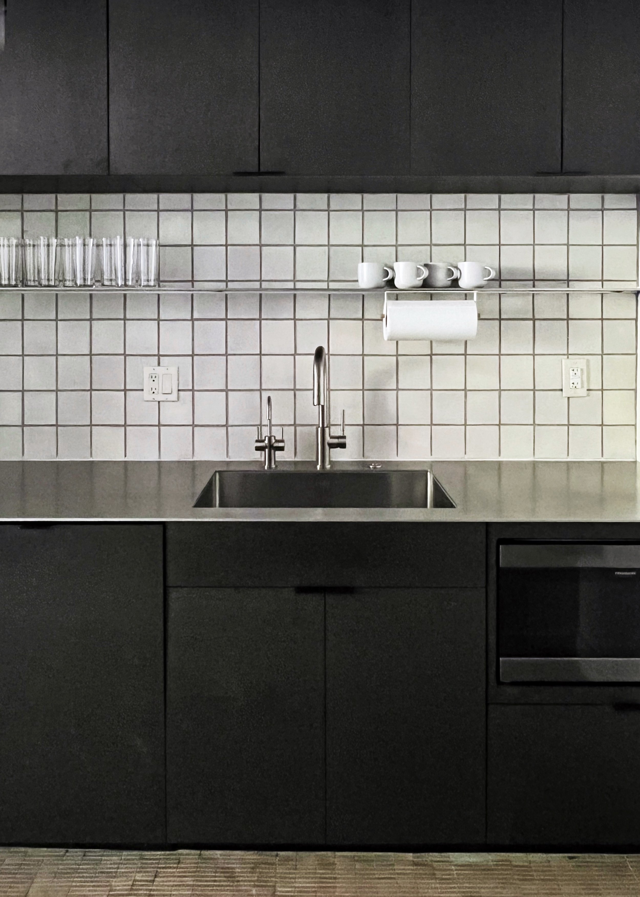
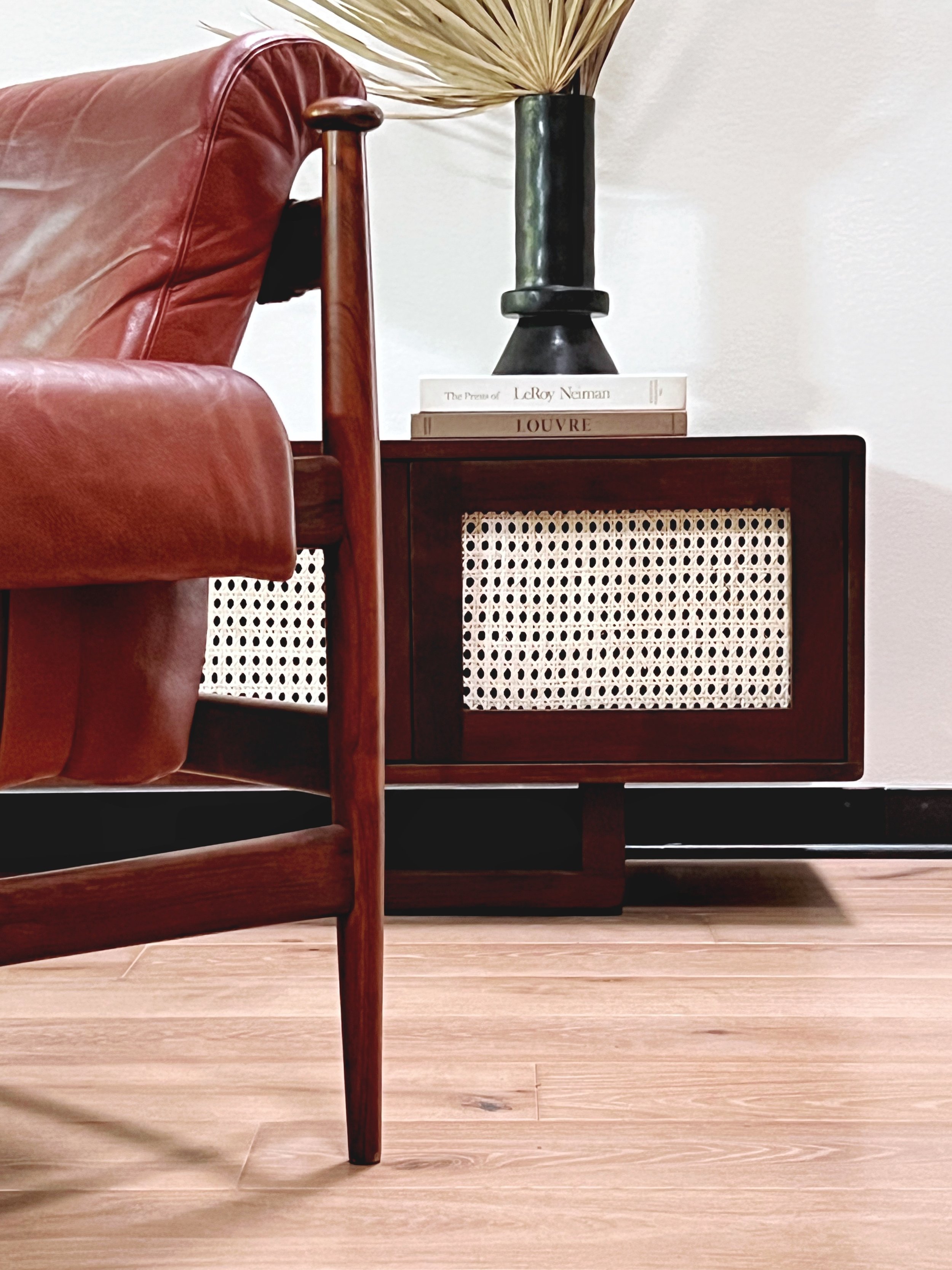
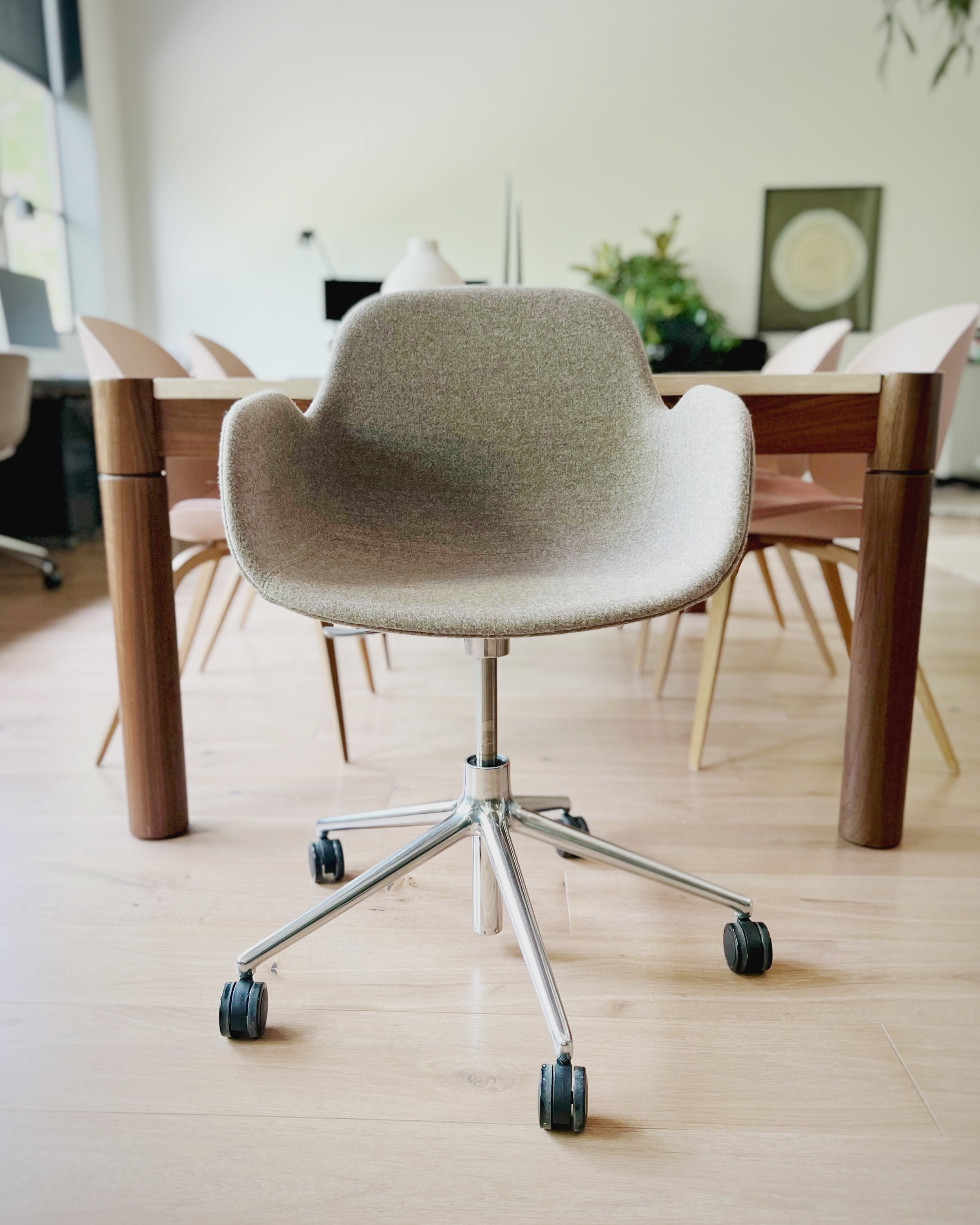
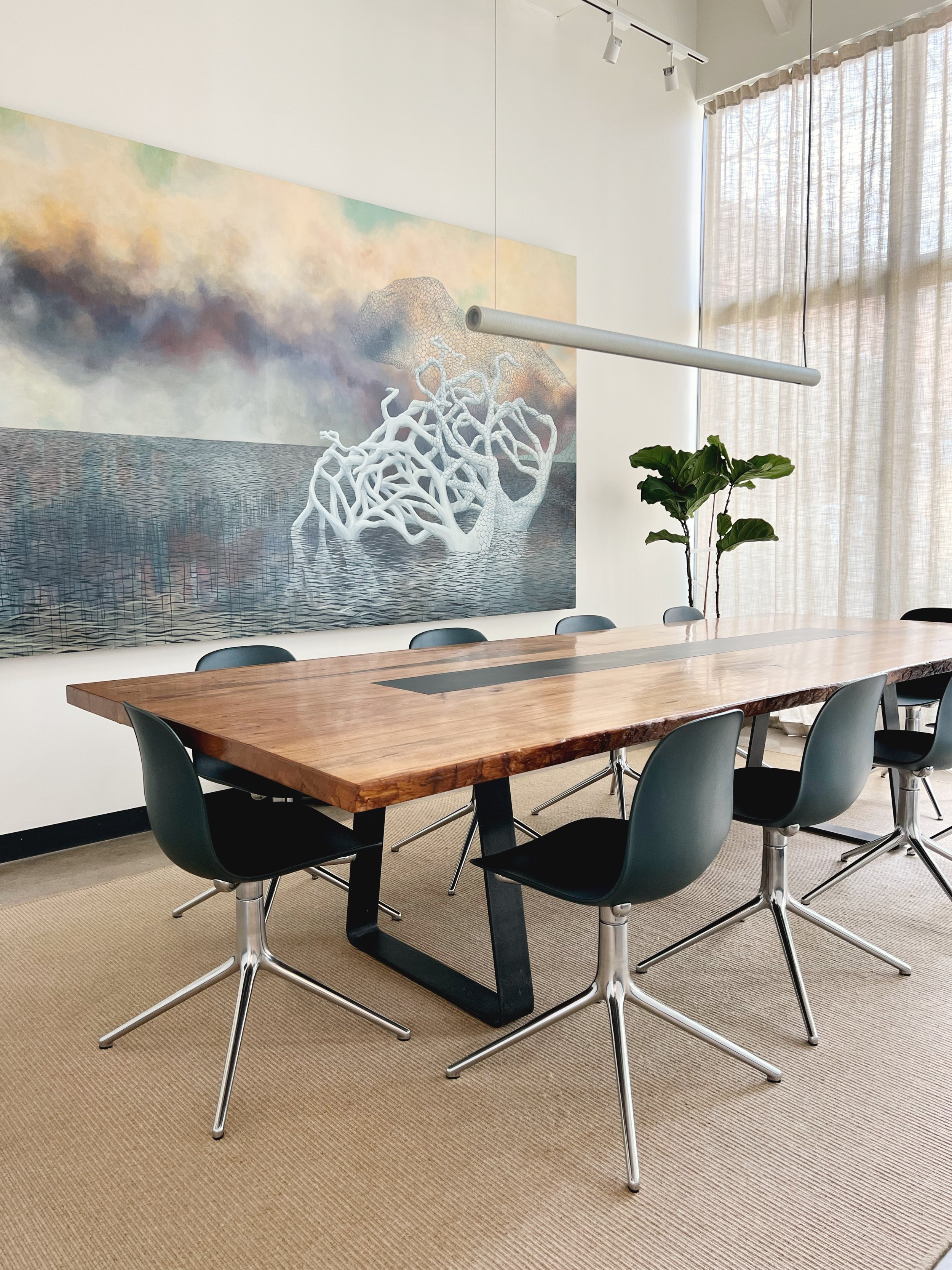
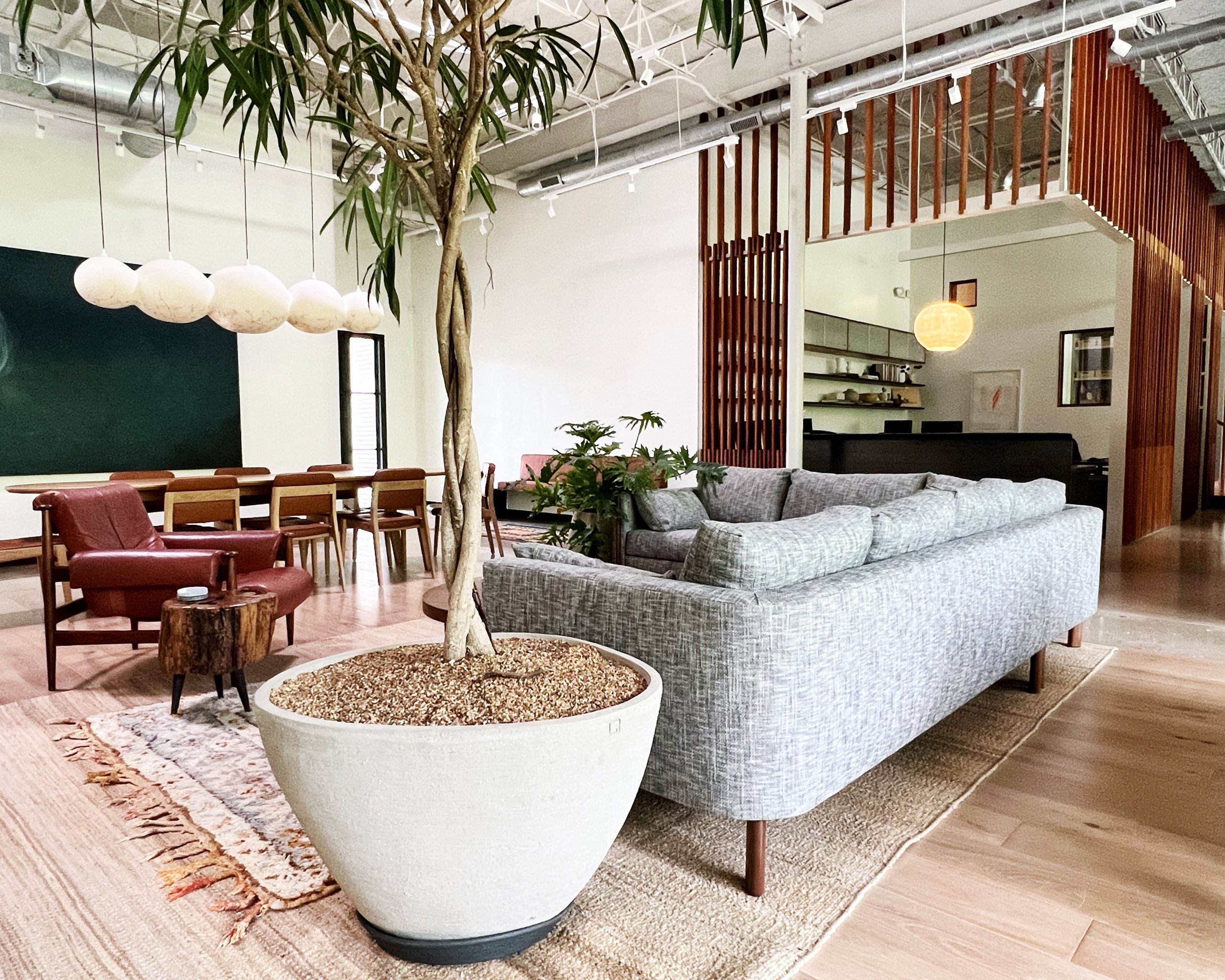
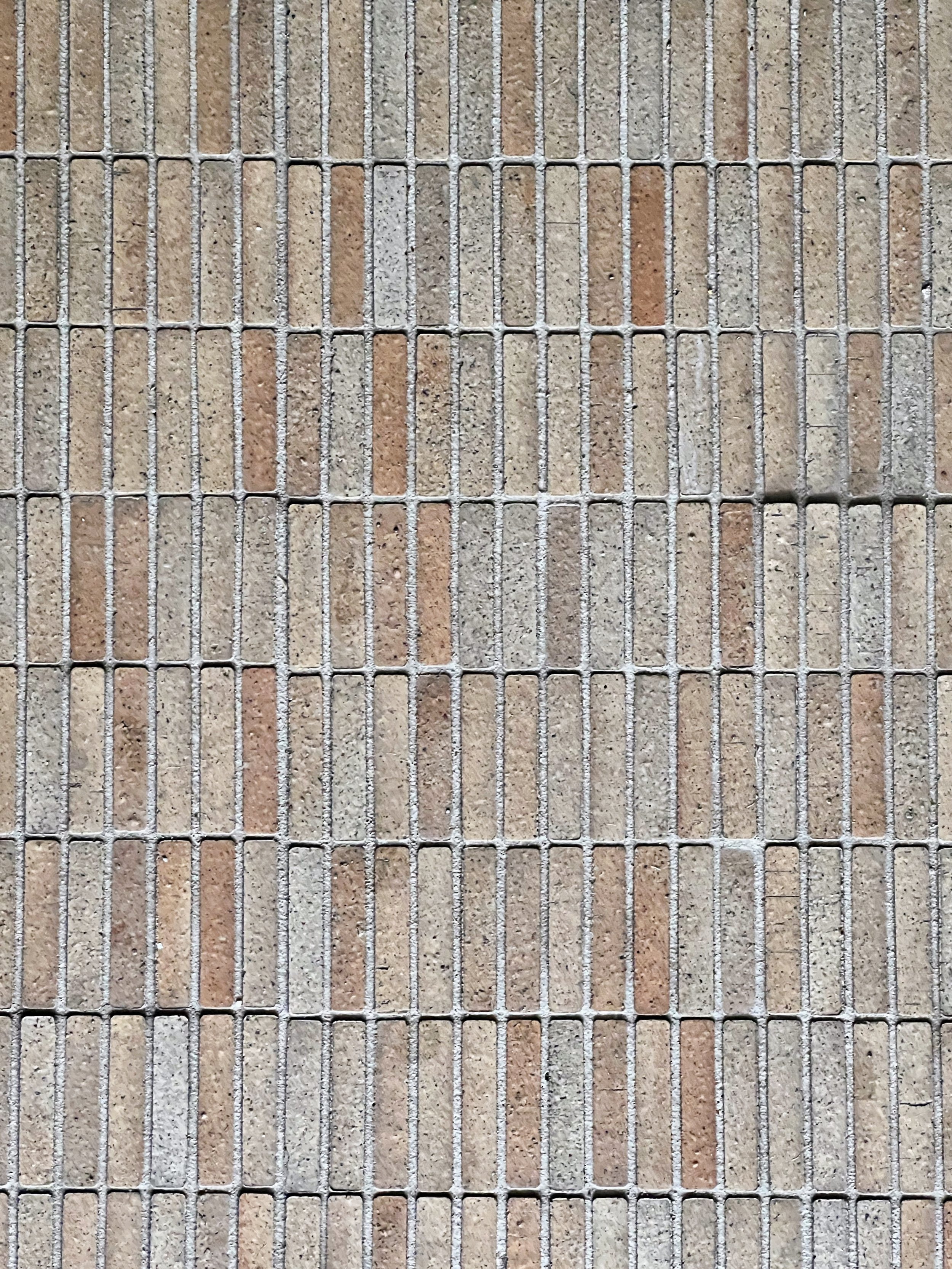
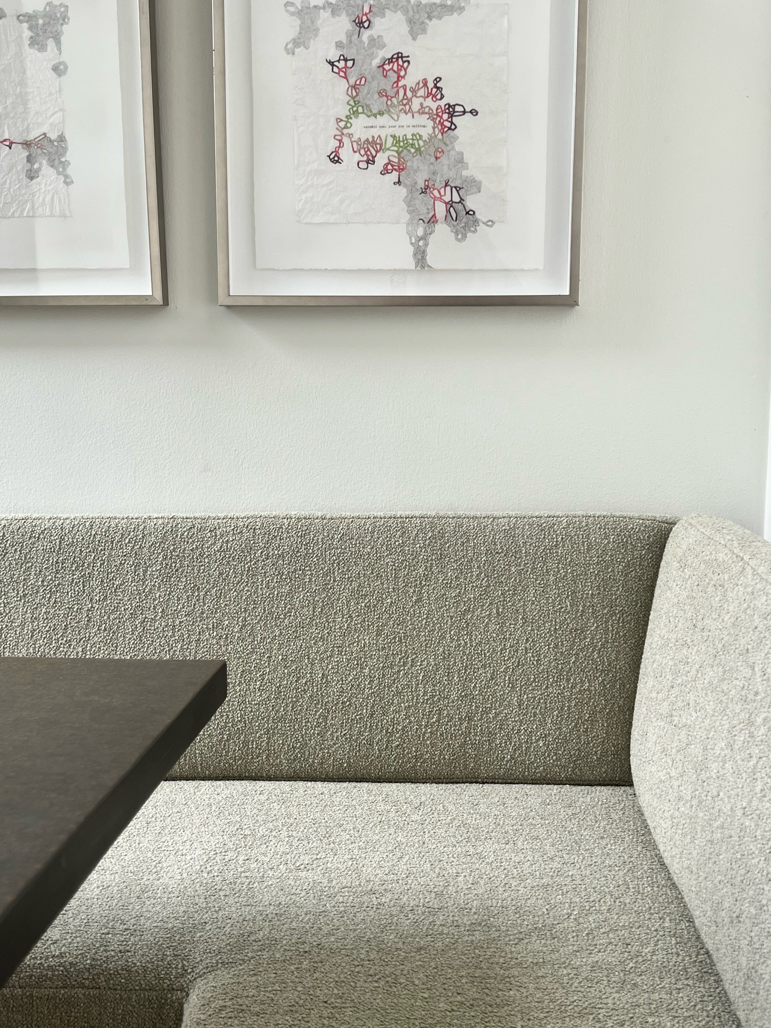
Designing a real estate development firm’s office could be a humdrum assignment, but that was far from the case here. Thanks to the inhabitants of the office, the project was truly collaborative and filled with additive textures, colors, and art to make it a truly un-office-y place to work.
How do you decorate the anti-office? You talk to everyone in it and ask what they’d like most in their homes. A room for relaxing and collecting your thoughts? Yup, sure. A kitchen made with aluminum counters and compressed paper cabinets? Yes please. Corner upon corner to tuck away and take calls, a big living room in the middle, sound-deadening felt ceilings, massive windows to the backyard, daylit corners everywhere, showers for the bike commuters and gym-goers, a wet bar, and some great art hand-picked by the office crew? Yes. Of. Course.
COLLABORATORS
Big thanks to the Topo team - Daryl, Ann, Ellie.
Lauren - thanks for bringing me on board, and thanks for sharing your great taste. Holly Beth, thank you for the brilliant color wisdom and all of your good taste.
MK - love the pics and your help always, and gracias to Michael Hsu crew for the best laid plans.


